
Report
Get your Company report at affordable price
- No Hidden Charges
- Lowest Price Guarantee
- Quick and Hassle-Free Process Free Expert
- Assistance for Lifetime
Get Expert Consultation
Profit and Loss Statement
A Profit and Loss Statement (P&L), also known as an income statement, is a financial document that summarizes a company’s revenues, costs, and expenses over a specific period, typically a fiscal quarter or year. The main purpose of the P&L is to provide a clear view of a company’s financial performance, showing how much money the business has made or lost.
- Revenue (Sales)
- Cost of Goods Sold (COGS)
Gross Profit - Operating Expenses
- Operating Income (Operating Profit)
- Other Income and Expenses
- Income Before Taxes
- Income Tax Expense
- Net Income (Net Profit or Loss)


Customer Monthly Reports
In the competitive landscape of modern business, understanding customer behavior and engagement is crucial for driving growth and improving service quality. A Customer Monthly Report is a valuable tool that provides insights into various aspects of customer interactions and performance over a month. This report helps businesses identify trends, measure success, and make data-driven decisions.
- Customer Overview
- Customer Engagement Metrics
- Sales and Revenue Insights
- Customer Satisfaction
- Customer Feedback and Insights
- Customer Segmentation
- Campaign Performance
- Service Metrics
Statement-Wise Graph Report
Purpose of a Statement-Wise Graph Report
A statement-wise graph report visualizes different financial statements or performance metrics to illustrate trends, comparisons, and relationships over time. It helps stakeholders quickly grasp complex data and make informed decisions.
types of Statements to Include
Depending on the context, you may include various statements such as:
- Profit and Loss Statement: Shows revenues, costs, and expenses, leading to net income.
- Balance Sheet: Provides information on assets, liabilities, and equity.
- Cash Flow Statement: Details cash inflows and outflows from operating, investing, and financing activities.
- Sales Report: Details sales performance, often broken down by product, region, or time period.
- Customer Metrics: Includes customer acquisition, churn rates, and engagement statistics.
Steps to Create a Statement-Wise Graph Report
- Gather Data
- Collect data from the relevant financial or performance statements. Ensure data accuracy and completeness.
- Select Key Metrics
- Determine which metrics are most important for your analysis. For financial statements, this might include revenue, net income, and expenses. For sales reports, this could be total sales, average deal size, and sales growth.
- Choose Graph Types
- Decide which types of graphs best represent your data. Use line charts for trends, bar charts for comparisons, and pie charts for proportions.
- Create Graphs
- Use graphing tools or software (e.g., Excel, Google Sheets, Tableau) to create your graphs. Input your data and customize the appearance of each graph for clarity.
- Analyze Trends
- Look for patterns and trends in your graphs. Identify any significant changes, correlations, or anomalies.
- Add Context
- Provide context and explanations for each graph. Describe what the data shows and highlight any key insights.
- Compile the Report
- Organize the graphs into a comprehensive report. Include an introduction, explanation of each graph, and a summary of findings.
- Review and Revise
- Review the report for accuracy and clarity. Revise as needed to ensure the report effectively communicates the desired insights.

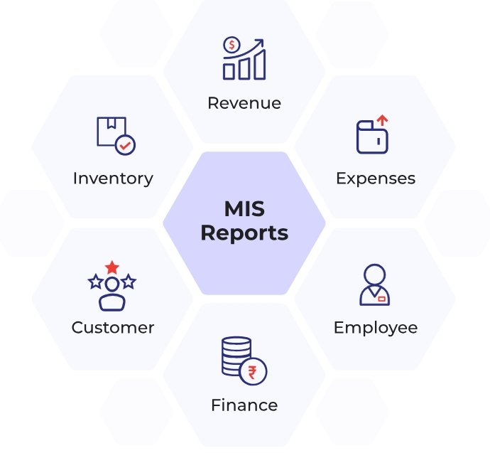
MIS Report
Purpose of the Inventory-Wise Sales MIS Report
The primary purpose of an Inventory-Wise Sales MIS Report is to:
- Analyze the relationship between inventory levels and sales performance.
- Identify trends in inventory turnover and sales.
- Optimize inventory management to prevent stockouts or overstock situations.
- Inform strategic decisions regarding pricing, promotions, and stock levels.
Key Components of the Report
- Inventory Overview
- Total Inventory Value: The total value of all inventory items.
- Stock Levels: Current stock levels of each item.
- Reorder Levels: Thresholds at which inventory should be reordered.
- Sales Data
- Total Sales: Total revenue generated from sales for the reporting period.
- Sales by Product: Revenue and units sold for each product or SKU (Stock Keeping Unit).
- Sales Trends: Trends in sales over time, such as monthly or quarterly sales growth.
- Inventory Turnover
- Inventory Turnover Ratio: A measure of how often inventory is sold and replaced over a period. Calculated as: Inventory Turnover Ratio=Cost of Goods Sold (COGS)Average Inventory\text{Inventory Turnover Ratio} = \frac{\text{Cost of Goods Sold (COGS)}}{\text{Average Inventory}}Inventory Turnover Ratio=Average InventoryCost of Goods Sold (COGS)
- Days Sales of Inventory (DSI): Average number of days it takes to sell the entire inventory.
- Stockout and Overstock Analysis
- Stockout Instances: Number of times items were out of stock during the reporting period.
- Overstock Instances: Instances where inventory levels exceeded optimal levels, leading to potential markdowns or holding costs.
- Sales Performance Metrics
- Gross Profit Margin: Percentage of revenue remaining after subtracting the cost of goods sold.
- Product Performance Analysis
- Top-Selling Products: Products with the highest sales volume or revenue.
- Low-Performing Products: Products with low sales or high inventory holding costs.
- Recommendations and Insights
- Inventory Optimization: Suggestions for adjusting stock levels based on sales data.
- Sales Strategies: Recommendations for pricing, promotions, or discontinuing underperforming products.
Steps to Create the Report
- Data Collection
- Gather data from inventory management systems, sales records, and financial statements. Ensure accuracy and completeness.
- Organize Data
- Structure the data by product or SKU, including sales figures, inventory levels, and costs. Use spreadsheets or database tools for organization.
- Generate Graphs and Charts
- Create visualizations to represent key metrics:
- Bar Charts: Compare sales by product or SKU.
- Line Charts: Show trends in inventory levels and sales over time.
- Pie Charts: Display the proportion of total sales contributed by each product.
- Create visualizations to represent key metrics:
- Analyze Data
- Look for patterns and correlations between inventory levels and sales performance. Identify any issues such as frequent stockouts or excessive inventory.
- Compile the Report
- Combine your data, graphs, and analysis into a comprehensive report. Include sections for inventory overview, sales performance, and recommendations.
- Review and Finalize
- Ensure the report is clear, accurate, and actionable. Revise as needed based on feedback from stakeholders.